Colors have the remarkable ability to shape the ambiance and mood of a room, influencing how we feel and interact with the space. Whether you are looking to create a relaxing sanctuary, an energizing workspace, or a vibrant living area, choosing the right color palette is key to bringing your vision to life. In this article, we will explore the importance of color in home décor, how to choose the perfect palette, and offer practical tips for incorporating color into different spaces.
The Power of Color in Interior Design
Color is one of the most powerful tools in interior design. It can influence our emotions, set the tone for a room, and even make a space appear larger or smaller. Each color evokes specific psychological responses, and understanding the impact of different hues is essential when selecting a palette for your home.
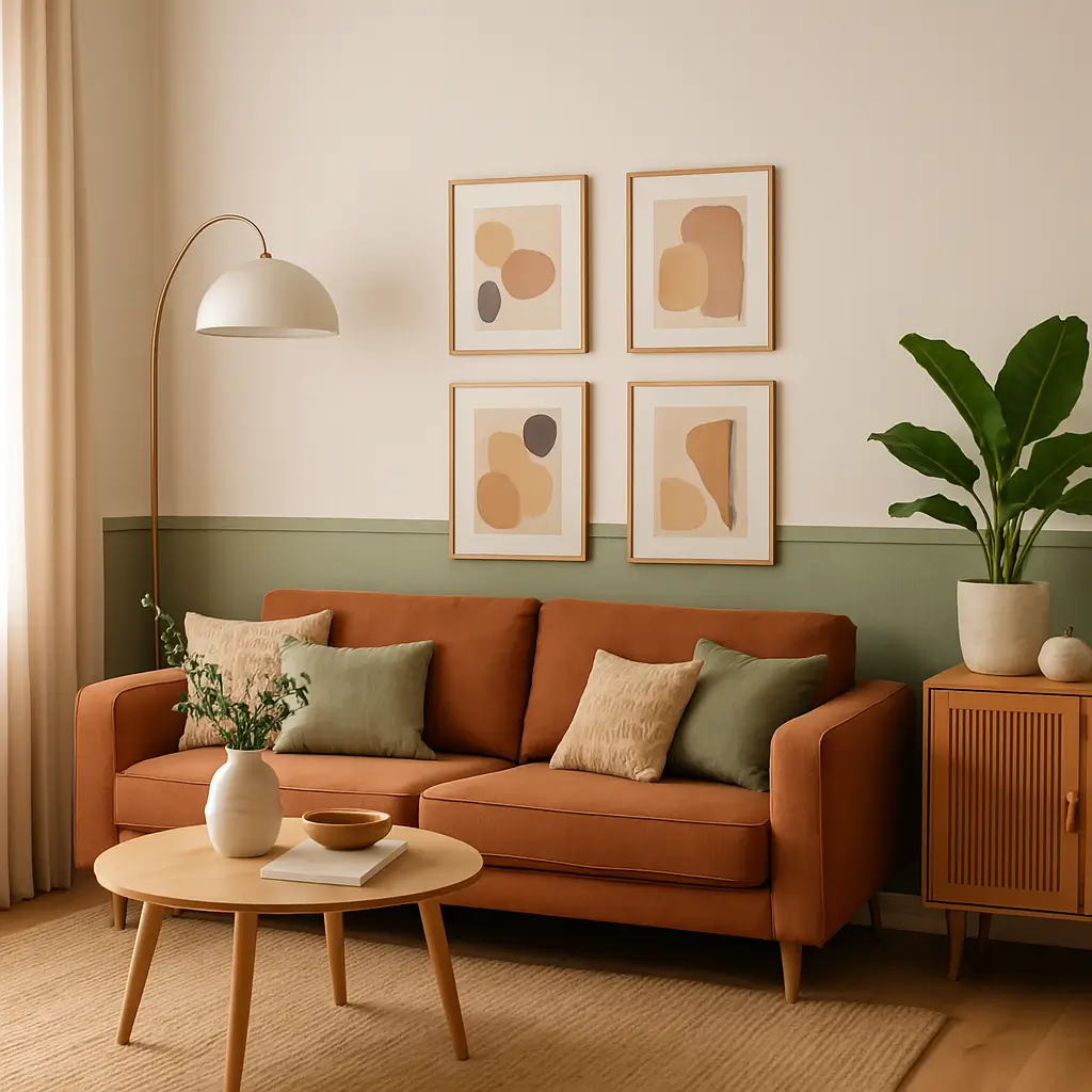
- Warm Colors (reds, oranges, yellows) can evoke feelings of warmth, energy, and excitement. They are ideal for spaces that require activity or socialization, like living rooms or kitchens. However, too much warmth can overwhelm a space, so balance is key.
- Cool Colors (blues, greens, purples) have a calming and soothing effect, perfect for bedrooms and bathrooms where relaxation is the priority. They are also ideal for smaller spaces, as they create an illusion of openness and tranquility.
- Neutral Colors (whites, grays, beiges) are versatile and timeless. They serve as a neutral backdrop that allows other elements in the room to stand out. Neutral tones are often used to create balance and harmony and can be combined with bolder colors for contrast.
- Accent Colors (bright, bold hues such as pink, turquoise, or emerald) bring a pop of personality to a room. Used sparingly, accent colors add vibrancy and can highlight specific areas or features within a space.
The Psychological Impact of Color
Before selecting your color palette, it’s important to understand the psychological effects that colors have on our minds. Different colors can evoke specific emotions, and choosing the right combination can set the right tone for each room in your home.
- Red: Associated with energy, passion, and action, red is an excellent choice for spaces that are meant for interaction, like dining rooms or living rooms. However, too much red can be overpowering, so it’s best used as an accent.
- Blue: Known for its calming properties, blue promotes tranquility and relaxation. It’s the perfect choice for bedrooms, bathrooms, or any space where you want to unwind. Light blues are especially ideal for creating an airy, peaceful atmosphere, while dark blues add sophistication and depth.
- Yellow: A cheerful, uplifting color, yellow can bring warmth and positivity to any room. It’s often used in kitchens or spaces where you want to encourage socializing and creativity. However, too much yellow can create anxiety, so it’s best to combine it with neutral tones.
- Green: Green is a natural, balanced color that symbolizes growth and harmony. It’s a versatile color that works well in living rooms, kitchens, and bedrooms. It has a grounding effect, and lighter greens can bring a fresh, airy feel, while darker greens create a cozy, sophisticated ambiance.
- Purple: Purple is a regal and luxurious color that brings elegance and creativity to a space. Lighter shades of purple, such as lavender, work well in bedrooms and bathrooms, while deeper purples like aubergine can add a dramatic touch to living rooms or dining areas.
How to Choose the Perfect Color Palette for Your Home
Selecting the right color palette for your home can be a daunting task, especially with so many shades and tones to consider. But with a few guidelines, you can confidently choose a palette that reflects your personal style and suits the needs of each room.
1. Start with Inspiration
The first step in choosing your perfect color palette is finding inspiration. This could come from a piece of artwork, a favorite fabric, a natural element, or even a memorable trip. The key is to choose colors that resonate with you emotionally and visually.
- Look at photos of rooms you admire.
- Consider the colors in your existing furniture, art, and décor.
- Take inspiration from nature—think of a landscape, a sunset, or a flower arrangement.
Your inspiration piece will help set the tone and give you a starting point for selecting complementary shades.
2. Consider the Function of the Room
Think about the purpose of each room and how you want it to feel. A color that works well in one room may not be suitable for another. The ambiance you create should align with the function of the space.
- Living Room: This is the heart of your home, where guests are entertained and family members relax. Consider warm neutrals for a welcoming atmosphere, complemented by bold accent colors to add personality.
- Bedroom: This is a space for rest and relaxation, so opt for calming colors like soft blues, grays, or greens. These colors promote sleep and tranquility, while deeper tones can add intimacy and coziness.
- Kitchen: Kitchens are often high-energy spaces, so bright, energizing colors like yellow, orange, or red can work well here. If you prefer a more subdued look, choose neutral tones with pops of color in accessories.
- Home Office: For productivity, choose colors that stimulate focus and creativity. Blues, greens, and soft neutrals are ideal for creating a calm yet motivating environment.
- Bathroom: Bathrooms are spaces for personal care, so choose colors that promote relaxation and cleanliness. Soft blues, greens, and whites are perfect for creating a spa-like atmosphere.
3. Test Before You Commit
Once you have a rough idea of your color palette, it’s essential to test your choices before committing to full-scale painting or purchasing new décor.
- Paint Samples: Buy small sample pots of paint and test them on your walls. Paint large swatches in different areas of the room to see how the color interacts with the lighting at different times of day.
- Swatch Books: If you’re struggling to find the right combination, swatch books are a great way to see how different colors complement each other.
- Digital Tools: Many paint brands and online resources offer digital tools that allow you to visualize different color schemes in your room, making it easier to experiment with combinations without actually painting the walls.
4. Balance Warm and Cool Tones
A successful color palette often balances warm and cool tones. Too many warm colors can make a room feel heavy, while too many cool tones can make it feel cold or sterile. Mix and match warm neutrals with pops of cool tones, or vice versa, to create harmony in the space.
For example, pairing soft beige with navy blue or charcoal gray with mustard yellow can create a dynamic yet balanced look. Use neutrals as the base and then introduce color accents to add depth and contrast.
5. Consider the Lighting
Lighting plays a significant role in how colors appear in a room. Natural light can make colors look brighter and more vibrant, while artificial light can change the hue and tone.
- Daylight: Natural light brings out the true color of paints and fabrics. If you have a room with plenty of natural light, feel free to experiment with bolder colors.
- Artificial Lighting: Warm lighting can make colors appear softer, while cooler lighting can intensify certain hues. It’s a good idea to test your color choices under both natural and artificial light to ensure they look as intended.
6. Don’t Forget About Accent Colors
While the main color palette sets the overall tone, accent colors are equally important in adding depth and interest to a room. These can be introduced through accessories like throw pillows, rugs, artwork, or accent walls.
For example, if your room has a neutral color scheme, a few accent pieces in bold colors can instantly elevate the space and make it more visually exciting. Consider using accent colors to highlight architectural features or bring attention to certain areas in the room.
7. Keep Your Personal Style in Mind
Ultimately, the colors you choose should reflect your personal style and taste. Don’t feel pressured to follow trends if they don’t align with your preferences. The beauty of decorating with color is that it allows you to express yourself.
- If you love vibrant, bold hues, embrace rich jewel tones or striking contrasts.
- If you prefer a more subdued look, neutral palettes with soft pastels or earth tones might be your best choice.
8. Create a Cohesive Flow
When decorating an entire home, it’s important to ensure that the color palette flows seamlessly from one room to another. While each room can have its unique palette, there should be a sense of continuity and harmony throughout the space.
One way to achieve this is by using a consistent base color throughout the home, whether it’s a neutral or a soft shade of blue or green. Then, add variation and depth in each room by introducing complementary colors through furniture, textiles, and accessories.
Conclusion
Choosing the perfect color palette for your home is an exciting process that involves balancing aesthetics, functionality, and personal taste. By understanding the psychological impact of colors, considering the function of each room, and testing your choices before committing, you can create a space that feels uniquely yours. Whether you prefer bold and vibrant hues or soft, tranquil tones, the right colors will transform your home into a beautiful, cohesive haven. So, start with inspiration, experiment with different combinations, and most importantly, trust your instincts to create a space that you love.